Class CtlGrid
Introduction
Class for working with gird (table) controls in a dialog.
EventArgsCallbackT
All EventArgsCallbackT callbacks include control_src as a keyword argument.
A callback can be in the format of:
def on_some_event(
    src: Any, event: EventArgs, control_src: CtlGrid, *args, **kwargs
) -> None:
    pass
or
def on_some_event(src: Any, event: EventArgs, *args, **kwargs) -> None:
    # can get control from kwargs
    ctl = cast(CtlGrid, kwargs['control_src'])
Example
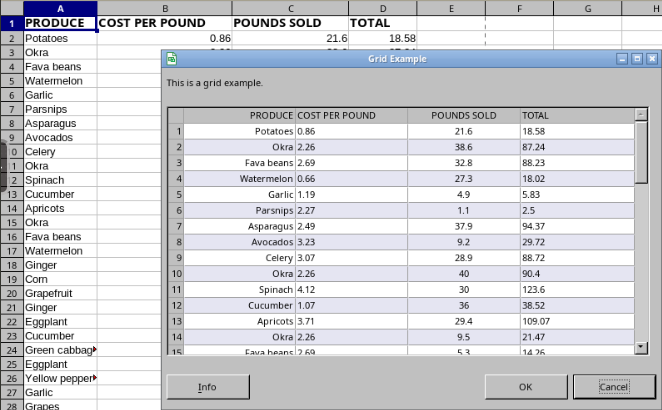
For an example see Tab and List Box Dialog Example
Class
- class ooodev.dialog.dl_control.CtlGrid(ctl)[source]
Bases:
DialogControlBase,UnoControlGridModelPartial,GridSelectionEventsClass for Grid Control
- __init__(ctl)[source]
Constructor
- Parameters:
ctl (UnoControlGrid) – Grid Control
- Return type:
None
- add_event_focus_events_disposing(cb)
Adds a listener for an event.
Event is invoked when the broadcaster is about to be disposed.
The callback
EventArgs.event_datawill contain a UNOcom.sun.star.lang.EventObjectstruct.- Return type:
None- Parameters:
cb (Any) –
- add_event_focus_gained(cb)
Adds a listener for an event.
Event is invoked when a window gains the keyboard focus.
The callback
EventArgs.event_datawill contain a UNOcom.sun.star.awt.FocusEventstruct.- Return type:
None- Parameters:
cb (Any) –
- add_event_focus_lost(cb)
Adds a listener for an event.
Event is invoked when a window loses the keyboard focus.
The callback
EventArgs.event_datawill contain a UNOcom.sun.star.awt.FocusEventstruct.- Return type:
None- Parameters:
cb (Any) –
- add_event_grid_selection_events_disposing(cb)
Adds a listener for an event.
Event is invoked when the broadcaster is about to be disposed.
The callback
EventArgs.event_datawill contain a UNOcom.sun.star.lang.EventObjectstruct.- Return type:
None- Parameters:
cb (Any) –
- add_event_key_events_disposing(cb)
Adds a listener for an event.
Event is invoked when the broadcaster is about to be disposed.
The callback
EventArgs.event_datawill contain a UNOcom.sun.star.lang.EventObjectstruct.- Return type:
None- Parameters:
cb (Any) –
- add_event_key_pressed(cb)
Adds a listener for an event.
Event is invoked when a key has been pressed.
The callback
EventArgs.event_datawill contain a UNOcom.sun.star.awt.KeyEventstruct.- Return type:
None- Parameters:
cb (Any) –
- add_event_key_released(cb)
Adds a listener for an event.
Event is invoked when a key has been released.
The callback
EventArgs.event_datawill contain a UNOcom.sun.star.awt.KeyEventstruct.- Return type:
None- Parameters:
cb (Any) –
- add_event_listener(listener)
Adds an event listener to the component.
- Parameters:
listener (XEventListener) – The event listener to be added.
- Return type:
None
- add_event_mouse_dragged(cb)
Adds a listener for an event.
Event is invoked when a mouse button is pressed on a window and then dragged.
The callback
EventArgs.event_datawill contain a UNOcom.sun.star.awt.MouseEventstruct.- Return type:
None- Parameters:
cb (Any) –
- add_event_mouse_entered(cb)
Adds a listener for an event.
Event is invoked when the mouse enters a window.
The callback
EventArgs.event_datawill contain a UNOcom.sun.star.awt.MouseEventstruct.- Return type:
None- Parameters:
cb (Any) –
- add_event_mouse_events_disposing(cb)
Adds a listener for an event.
Event is invoked when the broadcaster is about to be disposed.
The callback
EventArgs.event_datawill contain a UNOcom.sun.star.lang.EventObjectstruct.- Return type:
None- Parameters:
cb (Any) –
- add_event_mouse_exited(cb)
Adds a listener for an event.
Event is invoked when the mouse exits a window.
The callback
EventArgs.event_datawill contain a UNOcom.sun.star.awt.MouseEventstruct.- Return type:
None- Parameters:
cb (Any) –
- add_event_mouse_motion_events_disposing(cb)
Adds a listener for an event.
Event is invoked when the broadcaster is about to be disposed.
The callback
EventArgs.event_datawill contain a UNOcom.sun.star.lang.EventObjectstruct.- Return type:
None- Parameters:
cb (Any) –
- add_event_mouse_moved(cb)
Adds a listener for an event.
Event Is invoked when the mouse pointer has been moved on a window (with no buttons down).
The callback
EventArgs.event_datawill contain a UNOcom.sun.star.awt.MouseEventstruct.- Return type:
None- Parameters:
cb (Any) –
- add_event_mouse_pressed(cb)
Adds a listener for an event.
Event is invoked when a mouse button has been pressed on a window.
The callback
EventArgs.event_datawill contain a UNOcom.sun.star.awt.MouseEventstruct.- Return type:
None- Parameters:
cb (Any) –
- add_event_mouse_released(cb)
Adds a listener for an event.
Event is invoked when a mouse button has been released on a window.
The callback
EventArgs.event_datawill contain a UNOcom.sun.star.awt.MouseEventstruct.- Return type:
None- Parameters:
cb (Any) –
- add_event_observers(*args)
Adds observers that gets their
triggermethod called when this classtriggermethod is called.- Parameters:
args (EventObserver) – One or more observers to add.
- Return type:
None
Note
Observers are removed automatically when they are out of scope.
- add_event_paint_events_disposing(cb)
Adds a listener for an event.
Event is invoked when the broadcaster is about to be disposed.
The callback
EventArgs.event_datawill contain a UNOcom.sun.star.lang.EventObjectstruct.- Return type:
None- Parameters:
cb (Any) –
- add_event_properties_change(names, cb)
Add properties to listen for changes.
- Parameters:
names (Iterable[str]) – One or more property names to listen for changes.
cb (EventArgsCallbackT) – Callback that is invoked when an event is triggered.
- Raises:
ValueError – If names is empty.
- Return type:
None
Note
The callback
EventArgs.event_datawill contain a tuple ofcom.sun.star.beans.PropertyChangeEventobjects.Each time this method is called, the previous names are removed and the new names are added.
- add_event_property_change(name, cb)
Adds a listener for an event.
Event is invoked when property is changed.
The callback
EventArgs.event_datawill contain acom.sun.star.beans.PropertyChangeEventstruct.- Parameters:
name (str) – Property Name
cb (EventArgsCallbackT) – Callback
- Return type:
None
- add_event_property_change_events_disposing(name, cb)
Adds a listener for an event.
Event is invoked when the property listener is about to be disposed.
The callback
EventArgs.event_datawill contain a UNOcom.sun.star.lang.EventObjectstruct.- Parameters:
name (str) – Property Name
cb (EventArgsCallbackT) – Callback
- Return type:
None
- add_event_selection_changed(cb)
Adds a listener for an event.
Event is invoked after a selection was changed.
The callback
EventArgs.event_datawill contain a UNOcom.sun.star.awt.grid.GridSelectionEventstruct.- Return type:
None- Parameters:
cb (Any) –
- add_event_vetoable_change(name, cb)
Adds a listener for an event.
Event is invoked when property is changed.
The callback
EventArgs.event_datawill contain acom.sun.star.beans.PropertyChangeEventstruct.- Parameters:
name (str) – Property Name
cb (EventArgsCallbackT) – Callback
- Return type:
None
- add_event_vetoable_change_events_disposing(name, cb)
Adds a listener for an event.
Event is invoked when the property listener is about to be disposed.
The callback
EventArgs.event_datawill contain a UNOcom.sun.star.lang.EventObjectstruct.- Parameters:
name (str) – Property Name
cb (EventArgsCallbackT) – Callback
- Return type:
None
- add_event_window_events_disposing(cb)
Adds a listener for an event.
Event is invoked when the broadcaster is about to be disposed.
The callback
EventArgs.event_datawill contain a UNOcom.sun.star.lang.EventObjectstruct.- Return type:
None- Parameters:
cb (Any) –
Adds a listener for an event.
Event is invoked when the window has been hidden.
The callback
EventArgs.event_datawill contain a UNOcom.sun.star.awt.WindowEventstruct.- Return type:
None- Parameters:
cb (Any) –
- add_event_window_moved(cb)
Adds a listener for an event.
Event is invoked when the window has been moved.
The callback
EventArgs.event_datawill contain a UNOcom.sun.star.awt.WindowEventstruct.- Return type:
None- Parameters:
cb (Any) –
- add_event_window_paint(cb)
Adds a listener for an event.
Event Is invoked when a region of the window became invalid, e.g. when another window has been moved away.
The callback
EventArgs.event_datawill contain a UNOcom.sun.star.awt.PaintEventstruct.- Return type:
None- Parameters:
cb (Any) –
- add_event_window_resized(cb)
Adds a listener for an event.
Event is invoked when the window has been resized.
The callback
EventArgs.event_datawill contain a UNOcom.sun.star.awt.WindowEventstruct.- Return type:
None- Parameters:
cb (Any) –
- add_event_window_shown(cb)
Adds a listener for an event.
Event is invoked when the window has been shown.
The callback
EventArgs.event_datawill contain a UNOcom.sun.star.awt.WindowEventstruct.- Return type:
None- Parameters:
cb (Any) –
- add_property_change_listener(name, listener)
Adds a listener for property changes.
- Parameters:
name (str) – The name of the property.
listener (Any) – The listener to be added.
- Return type:
None
- add_vetoable_change_listener(name, listener)
Adds a listener for vetoable changes.
- Parameters:
name (str) – The name of the property.
listener (Any) – The listener to be added.
- Return type:
None
- apply_styles(*styles)
Applies styles to control
- Parameters:
*styles (
StyleT) – Styles to apply- Return type:
None
- static create(win, **kwargs)[source]
Creates a new instance of the control.
Keyword arguments are optional. Extra Keyword args are passed to the control as property values.
- Parameters:
win (XWindowPeer) – Parent Window
kwargs (Any) –
- Keyword Arguments:
- Returns:
New instance of the control.
- Return type:
Note
The UnoControlDialogElement interface is not included when creating the control with a window peer.
- create_clone()
Creates a clone of the object.
- Returns:
The clone.
- Return type:
XCloneable
- dispose()
Disposes the component.
- Return type:
None
- fire_event_properties_change(names)
Fires a sequence of PropertyChangeEvents
- Parameters:
names (Iterable[str]) – Sequence of property names to fire event for.
- Return type:
None
- getImplementationId()
- getTypes()
- get_control_kind()[source]
Gets the control kind. Returns
DialogControlKind.GRID_CONTROL- Return type:
DialogControlKind
- get_control_named_kind()[source]
Gets the control named kind. Returns
DialogControlNamedKind.GRID_CONTROL- Return type:
DialogControlNamedKind
- get_control_props()
Gets property set for a control model
- Parameters:
control_model (Any) – control model
- Returns:
Property set
- Return type:
XPropertySet | None
- get_property_set()
Gets the property set for this control
- Return type:
XPropertySet
- get_property_set_info()
Returns the property set info.
- Returns:
The property set info.
- Return type:
XPropertySetInfo
- get_property_value(name)
Returns the value of a property.
- Parameters:
name (str) – The name of the property.
- Returns:
The value of the property.
- Return type:
Any
- get_view()
- Return type:
XControl
- remove_event_focus_events_disposing(cb)
Removes a listener for an event
- Return type:
None- Parameters:
cb (Any) –
- remove_event_focus_gained(cb)
Removes a listener for an event
- Return type:
None- Parameters:
cb (Any) –
- remove_event_focus_lost(cb)
Removes a listener for an event
- Return type:
None- Parameters:
cb (Any) –
- remove_event_grid_selection_events_disposing(cb)
Removes a listener for an event
- Return type:
None- Parameters:
cb (Any) –
- remove_event_key_events_disposing(cb)
Removes a listener for an event
- Return type:
None- Parameters:
cb (Any) –
- remove_event_key_pressed(cb)
Removes a listener for an event
- Return type:
None- Parameters:
cb (Any) –
- remove_event_key_released(cb)
Removes a listener for an event
- Return type:
None- Parameters:
cb (Any) –
- remove_event_listener(listener)
Removes an event listener from the component.
- Parameters:
listener (XEventListener) – The event listener to be removed.
- Return type:
None
- remove_event_mouse_dragged(cb)
Removes a listener for an event
- Return type:
None- Parameters:
cb (Any) –
- remove_event_mouse_entered(cb)
Removes a listener for an event
- Return type:
None- Parameters:
cb (Any) –
- remove_event_mouse_events_disposing(cb)
Removes a listener for an event
- Return type:
None- Parameters:
cb (Any) –
- remove_event_mouse_exited(cb)
Removes a listener for an event.
- Return type:
None- Parameters:
cb (Any) –
- remove_event_mouse_motion_events_disposing(cb)
Removes a listener for an event
- Return type:
None- Parameters:
cb (Any) –
- remove_event_mouse_moved(cb)
Removes a listener for an event.
- Return type:
None- Parameters:
cb (Any) –
- remove_event_mouse_pressed(cb)
Removes a listener for an event.
Event is invoked when a mouse button has been pressed on a window.
- Return type:
None- Parameters:
cb (Any) –
- remove_event_mouse_released(cb)
Removes a listener for an event.
- Return type:
None- Parameters:
cb (Any) –
- remove_event_observer(observer)
Removes an observer
- Parameters:
observer (EventObserver) – One or more observers to add.
- Returns:
Trueif observer has been removed; Otherwise,False.- Return type:
bool
- remove_event_paint_events_disposing(cb)
Removes a listener for an event
- Return type:
None- Parameters:
cb (Any) –
- remove_event_properties_listener()
Remove Properties Listener
- Return type:
None
- remove_event_property_change(name)
Removes a listener for an event
- Parameters:
name (str) – Property Name
- Return type:
None
- remove_event_property_change_events_disposing(name)
Removes a listener for an event
- Parameters:
name (str) – Property Name
- Return type:
None
- remove_event_selection_changed(cb)
Removes a listener for an event
- Return type:
None- Parameters:
cb (Any) –
- remove_event_vetoable_change(name)
Removes a listener for an event
- Parameters:
name (str) – Property Name
- Return type:
None
- remove_event_vetoable_change_events_disposing(name)
Removes a listener for an event
- Parameters:
name (str) – Property Name
- Return type:
None
- remove_event_window_events_disposing(cb)
Removes a listener for an event.
- Return type:
None- Parameters:
cb (Any) –
Removes a listener for an event.
- Return type:
None- Parameters:
cb (Any) –
- remove_event_window_moved(cb)
Removes a listener for an event.
- Return type:
None- Parameters:
cb (Any) –
- remove_event_window_paint(cb)
Removes a listener for an event
- Return type:
None- Parameters:
cb (Any) –
- remove_event_window_resized(cb)
Removes a listener for an event.
- Return type:
None- Parameters:
cb (Any) –
- remove_event_window_shown(cb)
Removes a listener for an event.
- Return type:
None- Parameters:
cb (Any) –
- remove_property_change_listener(name, listener)
Removes a listener for property changes.
- Parameters:
name (str) – The name of the property.
listener (Any) – The listener to be removed.
- Return type:
None
- remove_vetoable_change_listener(name, listener)
Removes a listener for vetoable changes.
- Parameters:
name (str) – The name of the property.
listener (Any) – The listener to be removed.
- Return type:
None
- set_font_descriptor(font_descriptor)
Sets the font descriptor of the control.
- Parameters:
font_descriptor (FontDescriptor, FontDescriptorStructComp) – UNO Struct - Font descriptor to set.
- Return type:
None
Note
The
font_descriptorproperty can also be used to set the font descriptor.Hint
FontDescriptorcan be imported fromooo.dyn.awt.font_descriptor.
- Return type:
None
- Parameters:
font_descriptor (FontDescriptor | FontDescriptorStructComp) –
- set_property_value(name, value)
Sets the value of a property.
- Parameters:
name (str) – The name of the property.
value (Any) – The value of the property.
- Return type:
None
- set_table_data(data, *, widths=None, align=None, row_header_width=10, has_colum_headers=None, has_row_headers=None)[source]
Set the data in a table control. Preexisting data is cleared.
- Parameters:
data (Table) – 2D Sequence of data that is the data to set.
widths (Sequence[int] | None, optional) – Specifies Column Widths. If number of widths is less then the number of columns, the last width is used for the remaining columns. If omitted then each column is auto-sized to fill out the table width.
align (Iterable[HorizontalAlignment] | str | None, optional) – Specifies column alignments. See Note Below.
row_header_width (int, optional) – Specifies the width of the row header. Defaults to
10.has_colum_headers (bool | None, optional) – Specifies if the data has a column header. If omitted the table’s ShowColumnHeader property is used. Defaults to
None.has_row_headers (bool | None, optional) – Specifies if the data has a row header. If omitted the table’s ShowRowHeader property is used. Defaults to
None.
- Raises:
ValueError – if not a valid UnoControlGrid or if no data model.
- Return type:
None
Note
aligncan be a string of"L","R", or"C"for left, right, or center alignment or a list ofHorizontalAlignmentvalues. Ifalignvalues is lest then the number of columns, then the remaining columns will be aligned left.If
has_colum_headersisTruethen the first row of data is used for the column headers. Iftable.Model.ShowColumnHeaderisFalse, then the column header row is not used.If
has_colum_headersisFalseandtable.Model.ShowColumnHeaderisTruethen the column headers are set to the default column names such as (A, B, C, D).If
has_row_headersisTruethen the first row of data is used for the row headers. Iftable.Model.ShowRowHeaderisFalse, then the row header is not used.If
has_row_headersisFalseandtable.Model.ShowRowHeaderisTruethen the row headers are set to the default row names such as (1, 2, 3, 4).Example
# other code
tab_sz = self._ctl_tab.getPosSize()
ctl_table1 = Dialogs.insert_table_control(
    dialog_ctrl=self._tab_table,
    x=tab_sz.X + self._padding,
    y=tab_sz.Y + self._padding,
    width=tab_sz.Width - (self._padding * 2),
    height=300,
    grid_lines=True,
    col_header=True,
    row_header=True,
)

tbl = ... # get data as 2d sequence
Dialogs.set_table_data(
    table=ctl_table1,
    data=tbl,
    align="RLC", # first column right, second left, third center. All others left
    widths=(75, 60, 100, 40), # does not need to add up to total width, a factor will be used to auto size where needed.
    has_row_headers=True,
    has_colum_headers=True,
)
- subscribe_event(event_name, callback)
Add an event listener to current instance.
- Parameters:
event_name (str) – Event Name.
callback (EventCallback) – Callback of the event listener.
- Return type:
None
- trigger_event(event_name, event_args)
Trigger an event on current instance.
- Parameters:
event_name (str) – Event Name.
event_args (EventArgsT) – Event Args.
- Return type:
None
- unsubscribe_event(event_name, callback)
Remove an event listener from current instance.
- Parameters:
event_name (str) – Event Name.
callback (EventCallback) – Callback of the event listener.
- Return type:
None
- property active_selection_background_color: Color | None
Gets/Sets the color to be used when drawing the background of selected cells, while the control has the focus.
If this property has a value of
None, the grid control renderer will use some default color, depending on the control’s style settings.- Returns:
Color to be used when drawing the background of selected cells, while the control has the focus.
- Return type:
Color | None
- property active_selection_text_color: Color | None
Gets the color to be used when drawing the text of selected cells, while the control has the focus.
If this property has a value of VOID, the grid control renderer will use some default color, depending on the control’s style settings.
- Returns:
Color or None if not set.
- Return type:
Color | None
- property column_header_height: UnitAppFontHeight | None
Gets/Sets the height of the column header row, if applicable.
The height is specified in application font units.
The value given here is ignored if ShowColumnHeader is
False.If the property is
None, the grid control shall automatically determine a height which conveniently allows, according to the used font, to display one line of text.When setting the property the value can be set with
UnitTorfloatinAppFontunits.- Return type:
UnitAppFontHeight | None
- property column_model: com.sun.star.awt.grid.XGridColumnModel
Specifies the
XGridColumnModelthat is providing the column structure.You can implement your own instance of
XGridColumnModelor use the DefaultGridColumnModel.The column model is in the ownership of the grid model: When you set a new column model, or dispose the grid model, then the (old) column model is disposed, too.
The default for this property is an empty instance of the DefaultGridColumnModel.
- Return type:
XGridColumnModel
- property event_observer: EventObserver
Gets/Sets The Event Observer for this instance.
- Return type:
- property events_listener_focus: FocusListener
Returns listener
- Return type:
- property events_listener_grid_selection: GridSelectionListener
Returns listener
- Return type:
- property events_listener_key: KeyListener
Returns listener
- Return type:
- property events_listener_mouse: MouseListener
Returns listener
- Return type:
- property events_listener_mouse_motion: MouseMotionListener
Returns listener
- Return type:
- property events_listener_paint: PaintListener
Returns listener
- Return type:
- property events_listener_properties_change_implement: PropertiesChangeListener
Returns listener
- Return type:
- property events_listener_window: WindowListener
Returns listener
- Return type:
- property font_descriptor: FontDescriptorStructComp
Gets/Sets the Font Descriptor.
Setting value can be done with a
FontDescriptororFontDescriptorStructCompobject.- Returns:
Font Descriptor
- Return type:
Hint
FontDescriptorcan be imported fromooo.dyn.awt.font_descriptor.
- property font_emphasis_mark: FontEmphasisEnum
Gets/Sets the
FontEmphasisvalue of the text in the control.Note
Value can be set with
FontEmphasisEnumorint.Hint
FontEmphasisEnumcan be imported fromooo.dyn.text.font_emphasis.
- Return type:
FontEmphasisEnum
- property font_relief: FontReliefEnum
Gets/Sets
FontReliefvalue of the text in the control.Note
Value can be set with
FontReliefEnumorint.Hint
FontReliefEnumcan be imported fromooo.dyn.text.font_relief.
- Return type:
FontReliefEnum
- property grid_line_color: Color | None
Gets/Sets the color to be used when drawing lines between cells
If this property has a value of
None, the grid control renderer will use some default color, depending on the control’s style settings.- Returns:
Color or None if not set.
- Return type:
Color | None
- property h_scroll: bool
Gets/Sets the vertical scrollbar mode.
The default value is
False- Return type:
bool
- property header_background_color: Color | None
Gets/Sets the color to be used when drawing the background of row or column headers
If this property has a value of
None, the grid control renderer will use some default color, depending on the control’s style settings.- Returns:
Color or None if not set.
- Return type:
Color | None
- property header_text_color: Color | None
Gets/Sets the color to be used when drawing the text within row or column headers
If this property has a value of
None, the grid control renderer will use some default color, depending on the control’s style settings.- Returns:
Color or None if not set.
- Return type:
Color | None
- property help_text: str
Gets/Sets the tip text
- Return type:
str
- property help_url: str
Gets/Sets the help URL of the control.
- Return type:
str
- property horizontal_scrollbar: bool
Gets or sets if a horizontal scrollbar should be added to the dialog. Same as
h_scrollproperty.- Return type:
bool
- property inactive_selection_background_color: Color | None
Gets/Sets the color to be used when drawing the background of selected cells, while the control does not have the focus.
If this property has a value of
None, the grid control renderer will use some default color, depending on the control’s style settings.- Returns:
Color or None if not set.
- Return type:
Color | None
- property inactive_selection_text_color: Color | None
Gets/Sets the color to be used when drawing the text of selected cells, while the control does not have the focus.
If this property has a value of
None, the grid control renderer will use some default color, depending on the control’s style settings.- Returns:
Color or None if not set.
- Return type:
Color | None
- property list_count: int
Gets the number of items in the combo box
- Return type:
int
- property list_index: int
Gets which row index is selected in the gird.
- Return type:
int- Returns:
Index of the first selected row or
-1if no rows are selected.
- property model: com.sun.star.awt.grid.UnoControlGridModel
Uno Control Model
- Return type:
UnoControlGridModel
- property model_ex: ModelGrid
Gets the extended Model for the control.
This is a wrapped instance for the model property. It add some additional properties and methods to the model.
- Return type:
- property row_background_colors: Tuple[Color, ...]
Gets/Sets the colors to be used as background for data rows.
If this sequence is non-empty, the data rows will be rendered with alternating background colors: Assuming the sequence has n elements, each row will use the background color as specified by its number’s remainder modulo n.
If this sequence is empty, all rows will use the same background color as the control as whole.
If this property is empty, rows will be painted in alternating background colors, every second row having a background color derived from the control’s selection color.
- Returns:
Tuple of ~ooodev.utils.color.Color objects.
- Return type:
Tuple[Color, …]
- property row_header_width: UnitAppFontWidth | None
Gets/Sets the width of the row header column, if applicable.
The width is specified in application font units.
The value given here is ignored if
show_row_headerisFalse.When setting the property the value can be set with
UnitTorfloatinAppFontunits.- Return type:
UnitAppFontWidth | None
- property row_height: UnitAppFontHeight | None
Gets/Sets the height of rows in the grid control.
The height is specified in application font units.
When setting the property the value can be set with
UnitTorfloatinAppFontunits.- Return type:
UnitAppFontHeight | None
- property selection_model: SelectionType
Gets/Sets the selection mode that is enabled for this grid control.
The default value is
com.sun.star.view.SelectionType.SINGLEHint
SelectionTypecan be imported fromooo.dyn.view.selection_type
- Return type:
SelectionType
- property show_column_header: bool
Gets/Sets whether the grid control should display a title row.
The default value is
True.- Return type:
bool
- property show_row_header: bool
Gets/Sets whether the grid control should display a special header column.
The default value is
False.- Return type:
bool
- property tabstop: bool
Gets/Sets - that the control can be reached with the TAB key.
- Return type:
bool
- property text_color: Color
Gets/Sets the text color of the control.
- Returns:
Text color.
- Return type:
- property text_line_color: Color
Gets/Sets the text line color of the control.
- Returns:
Text line color.
- Return type:
- property tip_text: str
Gets/Sets the tip text
- Return type:
str
- property use_grid_lines: bool
Gets/Sets whether or not to paint horizontal and vertical lines between the grid cells.
- Return type:
bool
- property v_scroll: bool
Gets/Sets the horizontal scrollbar mode.
The default value is
False.- Return type:
bool
- property vertical_align: VerticalAlignment
Gets/Sets the vertical alignment of the text in the control.
optional
Hint
VerticalAlignmentcan be imported fromooo.dyn.style.vertical_alignment
- Return type:
VerticalAlignment
- property vertical_scrollbar: bool
Gets or sets if a vertical scrollbar should be added to the dialog. Same as
v_scrollproperty.- Return type:
bool
- property view: com.sun.star.awt.grid.UnoControlGrid
Uno Control
- Return type:
UnoControlGrid
- property visible: bool
Gets/Sets the visible state for the control
- Return type:
bool