Chapter 30. Bar, Pie, Area, Line Charts
This chapter continues using the Chart2 Views example from the previous chapter, but looks at how bar, pie (including 3D and donut versions), area, and line charts can be generated from spreadsheet data. The relevant lines of chart_2_views.py are:
# Chart2View.main() ofchart_2_views.py
def main(self) -> None:
    _ = Lo.load_office(connector=Lo.ConnectPipe(), opt=Lo.Options(verbose=True))

    try:
        doc = Calc.open_doc(fnm=self._data_fnm)
        GUI.set_visible(is_visible=True, odoc=doc)
        sheet = Calc.get_sheet(doc=doc)

        chart_doc = None
        if self._chart_kind == ChartKind.AREA:
            chart_doc = self._area_chart(doc=doc, sheet=sheet) # section 3
        elif self._chart_kind == ChartKind.BAR:
            chart_doc = self._bar_chart(doc=doc, sheet=sheet) # section 1
        elif self._chart_kind == ChartKind.BUBBLE_LABELED:
            chart_doc = self._labeled_bubble_chart(doc=doc, sheet=sheet)
        elif self._chart_kind == ChartKind.COLUMN:
            chart_doc = self._col_chart(doc=doc, sheet=sheet)
        elif self._chart_kind == ChartKind.COLUMN_LINE:
            chart_doc = self._col_line_chart(doc=doc, sheet=sheet)
        elif self._chart_kind == ChartKind.COLUMN_MULTI:
            chart_doc = self._mult_col_chart(doc=doc, sheet=sheet)
        elif self._chart_kind == ChartKind.DONUT:
            chart_doc = self._donut_chart(doc=doc, sheet=sheet) # 2.3
        elif self._chart_kind == ChartKind.HAPPY_STOCK:
            chart_doc = self._happy_stock_chart(doc=doc, sheet=sheet)
        elif self._chart_kind == ChartKind.LINE:
            chart_doc = self._line_chart(doc=doc, sheet=sheet) # section 4
        elif self._chart_kind == ChartKind.LINES:
            chart_doc = self._lines_chart(doc=doc, sheet=sheet) # section 4
        elif self._chart_kind == ChartKind.NET:
            chart_doc = self._net_chart(doc=doc, sheet=sheet)
        elif self._chart_kind == ChartKind.PIE:
            chart_doc = self._pie_chart(doc=doc, sheet=sheet)
        elif self._chart_kind == ChartKind.PIE_3D:
            chart_doc = self._pie_3d_chart(doc=doc, sheet=sheet) # section 2.1
        elif self._chart_kind == ChartKind.SCATTER:
            chart_doc = self._scatter_chart(doc=doc, sheet=sheet)
        elif self._chart_kind == ChartKind.SCATTER_LINE_ERROR:
            chart_doc = self._scatter_line_error_chart(doc=doc, sheet=sheet)
        elif self._chart_kind == ChartKind.SCATTER_LINE_LOG:
            chart_doc = self._scatter_line_log_chart(doc=doc, sheet=sheet)
        elif self._chart_kind == ChartKind.STOCK_PRICES:
            chart_doc = self._stock_prices_chart(doc=doc, sheet=sheet)

        # ...
30.1 The Bar Chart
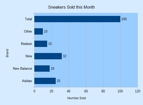
A bar chart is generated by _bar_chart() in chart_2_views.py using the “Sneakers Sold this Month” Table from Fig. 253.

Fig. 253 :The “Sneakers Sold this Month” Table.
The resulting chart is shown in Fig. 254.
It’s informative to compare the bar chart in Fig. 254 with the column chart for the same data in Fig. 241.
The data bars and axes have been swapped, so the x-axis in the column chart is the y-axis in the bar chart, and vice versa.
_bar_chart() is:
# Chart2View._bar_chart() in chart_2_views.py
def _bar_chart(self, doc: XSpreadsheetDocument, sheet: XSpreadsheet) -> XChartDocument:
    # uses "Sneakers Sold this Month" table
    range_addr = Calc.get_address(sheet=sheet, range_name="A2:B8")
    chart_doc = Chart2.insert_chart(
        sheet=sheet,
        cells_range=range_addr,
        cell_name="B3",
        width=15,
        height=11,
        diagram_name=ChartTypes.Bar.TEMPLATE_STACKED.BAR,
    )
    Calc.goto_cell(cell_name="A1", doc=doc)

    Chart2.set_title(
        chart_doc=chart_doc, title=Calc.get_string(sheet=sheet, cell_name="A1")
    )
    Chart2.set_x_axis_title(
        chart_doc=chart_doc, title=Calc.get_string(sheet=sheet, cell_name="A2")
    )
    Chart2.set_y_axis_title(
        chart_doc=chart_doc, title=Calc.get_string(sheet=sheet, cell_name="B2")
    )
    # rotate x-axis which is now the vertical axis
    Chart2.rotate_y_axis_title(chart_doc=chart_doc, angle=Angle(90))
    return chart_doc
Although the axes have been swapped in the chart drawing, the API still uses the same indices to refer to the axes in XCoordinateSystem.getAxisByDimension().
This means that x-axis is the vertical axis in a bar chart, and y-axis the horizontal.
This is most apparent in the last line of _bar_chart():
Chart2.rotate_y_axis_title(chart_doc=chart_doc, angle=Angle(90))
See also
This causes the x-axis title to rotate 90 degrees counter-clockwise, which affects the Brand string on the vertical axis of the chart (see Fig. 254).
30.2 The Pie Chart
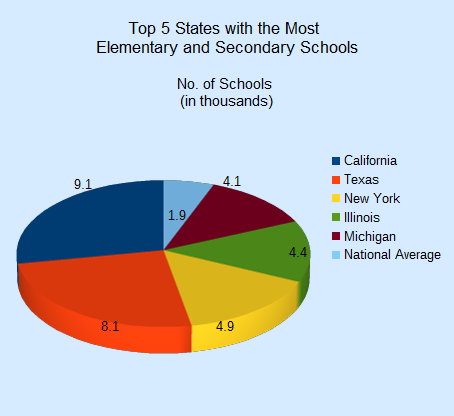
_pie_chart() in chart_2_views.py utilizes the “Top 5 States with the Most Elementary and Secondary Schools” table in chartsData.ods (see Fig. 255) to generate the pie chart in Fig. 256.

Fig. 255 :The “Top 5 States” Table.

_pie_chart() is:
# Chart2View._pie_chart() in chart_2_views.py
def _pie_chart(self, doc: XSpreadsheetDocument, sheet: XSpreadsheet) -> XChartDocument:
    # uses "Top 5 States with the Most Elementary and Secondary Schools"
    range_addr = Calc.get_address(sheet=sheet, range_name="E2:F8")
    chart_doc = Chart2.insert_chart(
        sheet=sheet,
        cells_range=range_addr,
        cell_name="B10",
        width=12,
        height=11,
        diagram_name=ChartTypes.Pie.TEMPLATE_DONUT.PIE,
    )
    Calc.goto_cell(cell_name="A1", doc=doc)

    Chart2.set_title(
        chart_doc=chart_doc, title=Calc.get_string(sheet=sheet, cell_name="E1")
    )
    Chart2.set_subtitle(
        chart_doc=chart_doc, subtitle=Calc.get_string(sheet=sheet, cell_name="F2")
    )
    Chart2.view_legend(chart_doc=chart_doc, is_visible=True)
    return chart_doc
Chart2.set_subtitle() displays the secondary heading in the chart; there’s little difference between it and the earlier Chart2.set_title():
# in Chart2 class
@classmethod
def set_subtitle(cls, chart_doc: XChartDocument, subtitle: str) -> XTitle:
    try:
        diagram = chart_doc.getFirstDiagram()
        titled = Lo.qi(XTitled, diagram, True)
        title = cls.create_title(subtitle)
        titled.setTitleObject(title)
        fname = Info.get_font_general_name()
        cls.set_x_title_font(title, fname, 12)
        return title
    except ChartError:
        raise
    except Exception as e:
        raise ChartError(f'Error setting subtitle "{subtitle}" for chart') from e
The XTitled reference for the subtitle is obtained from XDiagram, whereas the chart title is part of XChartDocument.
30.2.1 More 3D Pizzazz
For some reason people like 3D pie charts, so _pie_3d_chart() in chart_2_views.py produces one (see Fig. 257) using the same table as the 2D version.
_pie_3d_chart() is the same as _pie_chart() except that the ThreeDPie template is used:
# Chart2View._pie_3d_chart() in chart_2_views.py
def _pie_3d_chart(self, doc: XSpreadsheetDocument, sheet: XSpreadsheet) -> XChartDocument:
    # uses "Top 5 States with the Most Elementary and Secondary Schools"
    range_addr = Calc.get_address(sheet=sheet, range_name="E2:F8")
    chart_doc = Chart2.insert_chart(
        sheet=sheet,
        cells_range=range_addr,
        cell_name="B10",
        width=12,
        height=11,
        diagram_name=ChartTypes.Pie.TEMPLATE_3D.PIE_3D,
    )
    Calc.goto_cell(cell_name="A1", doc=doc)

    Chart2.set_title(
        chart_doc=chart_doc, title=Calc.get_string(sheet=sheet, cell_name="E1")
    )
    Chart2.set_subtitle(
        chart_doc=chart_doc, subtitle=Calc.get_string(sheet=sheet, cell_name="F2")
    )
    Chart2.view_legend(chart_doc=chart_doc, is_visible=True)

    # ...
    # more code explained in a moment
The drawback of 3D pie charts is the shape distortion caused by the perspective. For example, the red segment in the foreground of Fig. 257 seems bigger than the dark blue segment at the back but that segment is numerical larger.
The default rotation of a 3D pie is -60 degrees around the horizontal so its bottom edge appears to extend out of the page, and 0 degrees rotation around the vertical.
These can be changed by modifying the RotationHorizontal and RotationVertical properties of the Diagram service.
For example:
# part of Chart2View._pie_3d_chart() in chart_2_views.py
diagram = chart_doc.getFirstDiagram()
Props.set(
    diagram,
    RotationHorizontal=0,  # -ve rotates bottom edge out of page; default is -60
    RotationVertical=-45,  # -ve rotates left edge out of page; default is 0 (i.e. no rotation)
)
This changes the pie chart’s appearance to be as in Fig. 258.
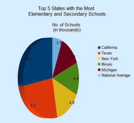
Fig. 258 :A Rotated 3D Pie Chart for the Table in Fig. 255.
The easiest way to see the current values for the diagram’s properties is to add a call to Props.show_obj_props() to the code above:
Props.show_obj_props("Diagram", diagram)
30.2.2 Changing the Data Point Labels
Two problems with Fig. 257 and Fig. 258 are the small data point labels and their default font color (black) which doesn’t stand out against the darker pie segments.
These issues can be fixed by changing some of the font related properties for the data points. This means a return to the DataSeries service shown in Fig. 259.

Fig. 259 :The DataSeries Service and XDataSeries Interface.
The DataPointProperties class appears twice in Fig. 259 because it allows the data point properties to be changed in two ways. The DataPointProperties class associated with the DataSeries service allows a property change to be applied to all the points collectively. The DataPointProperties class associated with a particular point allows a property to be changed only in that point.
For example, the former approach is used to change all the data point labels in the pie chart to 14pt, bold, and white:
# in Chart2View._pie_3d_chart() in chart_2_views.py
# ...
# change all the data points to be bold white 14pt
ds = Chart2.get_data_series(chart_doc)
Props.set(ds[0], CharHeight=14.0, CharColor=CommonColor.WHITE, CharWeight=FontWeight.BOLD)
#...
The changes to the chart are shown in Fig. 260.

Fig. 260 :A 3D Pie Chart with Changed Data Point Labels.
The second approach is employed to emphasize the “National Average” data point label, which is the last one in the series:
# end of Chart2View._pie_3d_chart() in chart_2_views.py
# ...
try:
    props = Chart2.get_data_point_props(chart_doc=chart_doc, series_idx=0, idx=0)
    Props.set(
        props,
        CharHeight=14.0,
        CharColor=CommonColor.WHITE,
        CharWeight=FontWeight.BOLD
    )
except mEx.NotFoundError:
    Lo.print("No Properties found for chart.")
return chart_doc
This produces the chart shown in Fig. 261, where only the National Average label is changed.

Fig. 261 :A 3D Pie Chart with One Changed Data Point Label.
Chart2.get_data_point_props() takes three arguments - the chart document, the index of the data series, and the index of the data point inside that series.
The pie chart uses six data points, so a valid index will be between 0 and 5.
If a matching data point is found by Chart2.get_data_point_props() then a reference to its properties is returned, allowing that point to be modified:
# in Chart2 class
@classmethod
def get_data_point_props(
    cls, chart_doc: XChartDocument, series_idx: int, idx: int
) -> XPropertySet:
    props = cls.get_data_points_props(chart_doc=chart_doc, idx=series_idx)
    if not props:
        raise NotFoundError("No Datapoints found to get XPropertySet from")

    if idx < 0 or idx >= len(props):
        raise IndexError(f"Index value of {idx} is out of of range")

    return props[idx]
Also there is Calc.get_data_points_props() that takes two args and returns the properties for all the data points in a series:
# in Chart2 class
@classmethod
def get_data_points_props(cls, chart_doc: XChartDocument, idx: int) -> List[XPropertySet]:
    data_series_arr = cls.get_data_series(chart_doc=chart_doc)
    if idx < 0 or idx >= len(data_series_arr):
        raise IndexError(f"Index value of {idx} is out of of range")

    props_lst: List[XPropertySet] = []
    i = 0
    while True:
        try:
            props = data_series_arr[idx].getDataPointByIndex(i)
            if props is not None:
                props_lst.append(props)
            i += 1
        except Exception:
            props = None

        if props is None:
            break
    if len(props_lst) > 0:
        Lo.print(f"No Series at index {idx}")
    return props_lst
Chart2.get_data_series() is called to get the data series for the chart type as a tuple.
This tuple is iterated over, collecting the property sets for each data point by calling XDataSeries.getDataPointByIndex().
30.2.3 Anyone for Donuts?
If a table has more than one column of data then a Donut chart can be used to show each column as a ring.
_donut_chart() in chart_2_views.py utilizes the “Annual Expenditure on Institutions” table in chartsData.ods (see Fig. 262) to generate the donut chart with two rings in Fig. 263.

Fig. 262 :The “Annual Expenditure on Institutions” Table.

_donut_chart() is:
# Chart2View._donut_chart() in chart_2_views.py
def _donut_chart(self, doc: XSpreadsheetDocument, sheet: XSpreadsheet) -> XChartDocument:
    # uses the "Annual Expenditure on Institutions" table
    range_addr = Calc.get_address(sheet=sheet, range_name="A44:C50")
    chart_doc = Chart2.insert_chart(
        sheet=sheet,
        cells_range=range_addr,
        cell_name="D43",
        width=15,
        height=11,
        diagram_name=ChartTypes.Pie.TEMPLATE_DONUT.DONUT,
    )
    Calc.goto_cell(cell_name="A48", doc=doc)

    Chart2.set_title(chart_doc=chart_doc, title=Calc.get_string(sheet=sheet, cell_name="A43"))
    Chart2.view_legend(chart_doc=chart_doc, is_visible=True)
    subtitle = (
        f'Outer: {Calc.get_string(sheet=sheet, cell_name="B44")}\n'
        f'Inner: {Calc.get_string(sheet=sheet, cell_name="C44")}'
    )
    Chart2.set_subtitle(chart_doc=chart_doc, subtitle=subtitle)
    return chart_doc
The only thing of note is the use of a more complex string for Chart2.set_subtitle() to display information about both rings.
30.3 The Area Chart
_area_chart() in chart_2_views.py utilizes the “Trends in Enrollment in Public Schools in the US” table in chartsData.ods (see Fig. 264) to generate the area chart in Fig. 265.

Fig. 264 :The “Annual Expenditure on Institutions” Table.

# Chart2View._area_chart() in chart_2_views.py
def _area_chart(self, doc: XSpreadsheetDocument, sheet: XSpreadsheet) -> XChartDocument:
    # draws an area (stacked) chart;
    # uses "Trends in Enrollment in Public Schools in the US" table
    range_addr = Calc.get_address(sheet=sheet, range_name="E45:G50")
    chart_doc = Chart2.insert_chart(
        sheet=sheet,
        cells_range=range_addr,
        cell_name="A52",
        width=16,
        height=11,
        diagram_name=ChartTypes.Area.TEMPLATE_STACKED.AREA,
    )
    Calc.goto_cell(cell_name="A43", doc=doc)

    Chart2.set_title(
        chart_doc=chart_doc, title=Calc.get_string(sheet=sheet, cell_name="E43")
    )
    Chart2.set_x_axis_title(
        chart_doc=chart_doc, title=Calc.get_string(sheet=sheet, cell_name="E45")
    )
    Chart2.set_y_axis_title(
        chart_doc=chart_doc, title=Calc.get_string(sheet=sheet, cell_name="F44")
    )
    Chart2.view_legend(chart_doc=chart_doc, is_visible=True)
    Chart2.rotate_y_axis_title(chart_doc=chart_doc, angle=Angle(90))
    return chart_doc
If the Area template is replaced by StackedArea or PercentStackedArea then the two charts in Fig. 266 are generated.

Fig. 266 :Stacked and Percentage Stacked Area Charts for the Table in Fig. 264.
30.4 The Line Chart
_lines_chart() in chart_2_views.py utilizes the “Trends in Expenditure Per Pupil” table in chartsData.ods (see Fig. 267) to generate two lines marked with symbols in Fig. 268.

Fig. 267 :The “Trends in Expenditure Per Pupil” Table.

_lines_chart() is:
# Chart2View._lines_chart() in chart_2_views.py
def _line_chart(self, doc: XSpreadsheetDocument, sheet: XSpreadsheet) -> None:
    # draw a line chart with data points, no legend;
    # uses "Humidity Levels in NY" table
    range_addr = Calc.get_address(sheet=sheet, range_name="A14:B21")
    chart_doc = Chart2.insert_chart(
        sheet=sheet,
        cells_range=range_addr,
        cell_name="D13",
        width=16,
        height=9,
        diagram_name=ChartTypes.Line.TEMPLATE_SYMBOL.LINE_SYMBOL,
    )
    Calc.goto_cell(cell_name="A1", doc=doc)

    Chart2.set_title(
        chart_doc=chart_doc, title=Calc.get_string(sheet=sheet, cell_name="A13")
    )
    Chart2.set_x_axis_title(
        chart_doc=chart_doc, title=Calc.get_string(sheet=sheet, cell_name="A14")
    )
    Chart2.set_y_axis_title(
        chart_doc=chart_doc, title=Calc.get_string(sheet=sheet, cell_name="B14")
    )
Chart2.set_data_point_labels() switches off the displaying of the numerical data above the symbols so the chart is less cluttered.
There are many different line chart templates, as listed in Table 8.
The Line template differs from LineSymbol by not including symbols over the data points.